

Parcel Ascent and Normand’s Point#
Estimated reading time: 6 minutes
Why the Axes Are Rotated describes the grid. This page describes the one thing meteorologists draw on it: the path a parcel of air takes when something lifts it, and why the answer to “will this sounding produce a storm” is an area on that path rather than a number in a table.
import matplotlib.pyplot as plt

import tephpy
from tephpy import samples

snd = samples.sounding("norman-12z")
fig, ax = plt.subplots(subplot_kw={"projection": "tephigram"})
ax.plot_sounding(snd)
parcel = tephpy.calc.parcel_path(snd, label="surface parcel")
ax.plot_profile(parcel, color="k", linestyle="--")
ax.legend()
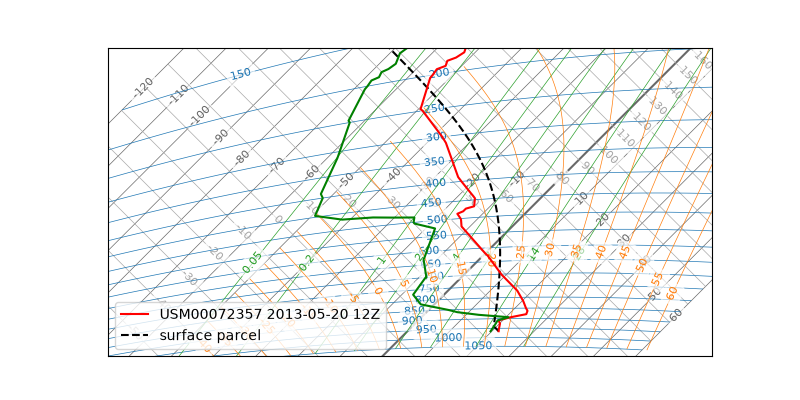
The dashed black line is the parcel. The red and green lines are the sounding — the atmosphere it is rising through. Everything below is what the dashed line is doing.
Lifting a Parcel#
Take a small volume of air at the surface and push it upward. It expands, because the pressure around it falls, and expanding costs energy, so it cools. If it exchanges no heat with its surroundings while this happens — a fair approximation over the timescales that matter — the process is adiabatic, and the parcel conserves its potential temperature.
Conserving θ is exactly what a dry adiabat is a line of. So the first stage of the ascent needs no computation on this diagram: the parcel slides up the dry adiabat it started on, and the diagram was built to make that a straight line.
Normand’s Point#
The parcel cools as it rises, but its moisture goes with it. Two quantities therefore approach each other: the temperature, falling along the dry adiabat, and the dewpoint, which falls much more slowly along a line of constant humidity mixing ratio. Where they meet, the parcel is saturated, and any further lifting condenses water. That height is the lifting condensation level — cloud base — and the intersection is Normand’s point.
The construction is the whole reason this diagram is drawn: two straight lines crossing, read off with a ruler. That is what a forecaster does with a pencil, and what the tephigram exists to make possible.
calc.normand_point(...) returns that point —
but it does not get there that way. It does not intersect the lines the diagram
draws; it asks MetPy for the
lifting condensation level, which is the same quantity reached by a
different route. The geometry is the meaning; MetPy’s is the arithmetic. How MetPy
arrives at it is MetPy’s business, and has already changed once — its lcl
still accepts max_iters and eps, deprecated and ignored, the fossil of an
iterative solver it no longer uses.
Above Normand’s point the parcel is saturated, and condensation releases latent heat. It still cools as it rises, but more slowly, so it follows a moist adiabat instead. That is the kink in the dashed line.
Where the Numbers Come From#
tephpy draws the construction; MetPy
computes it. That division is deliberate — spec §3.3 delegates the thermodynamics
rather than reimplementing them — and it matters to anyone deciding whether to
trust a value: a CAPE figure from
calc.indices(...) is MetPy’s number, drawn here.
calc.parcel_path(...) assembles the path from
the pieces above. It lifts from the surface by default, or from a mixed layer if
asked, and returns a Profile carrying the LCL it
actually used.
One convention deserves naming rather than appearing as a magic number.
Operational practice often shifts cloud base about 25 mb below the computed LCL,
because the construction assumes a parcel that is not mixing with its surroundings
and real ones do. tephpy neither applies that silently nor hides it: it is
cloud_base_correction, applied only when asked, and the value lives in
tephpy._constants.CLOUD_BASE_CORRECTION.
Why CAPE Is an Area#
Above cloud base, compare the parcel with the air around it. Where the parcel is warmer it is less dense, so it rises on its own — it is buoyant, and the atmosphere is doing work on it. Where it is colder, lifting it costs work instead.
The energy either way is the integral of the buoyancy over the ascent, and on a diagram whose coordinates are temperature and entropy an integral like that is an area. That is the property Why the Axes Are Rotated says the coordinates were chosen for, and this is where it pays: the two areas between the dashed parcel line and the environment curve are that CAPE and its counterpart convective inhibition, in joules per kilogram, readable by eye.
ax.shade_cape(...) and
ax.shade_cin(...) fill
them. On a diagram without this property — one whose axes were chosen for
something else — the same regions are still bounded, but their areas are not
energies, and shading them would be decoration.
Where to Go Next#
Emphasise a Reference Isopleth marks the reference lines a forecaster reads against, and the gallery shows the finished analyses this construction underlies.