

Why the Axes Are Rotated#
Estimated reading time: 10 minutes
A tephigram looks like a chart somebody turned forty-five degrees on the way to the printer. It is not. The rotation is the last step of a construction that starts by choosing two coordinates on physical grounds, and every awkward-looking thing about the diagram — the diagonal grid, the curved pressure lines, the absence of anything you could call a vertical axis — follows from that choice.
import matplotlib.pyplot as plt

import tephpy  # registers the "tephigram" projection

fig, ax = plt.subplots(subplot_kw={"projection": "tephigram"})
ax.isotherms(
    emphasis={
        0.0: {},  # the shipped default, kept: an accessor emphasis replaces it
        -20.0: {"color": "tab:red", "linewidth": 2.0},
    }
)
ax.dry_adiabats(emphasis={20.0: {"color": "tab:blue", "linewidth": 2.0}})
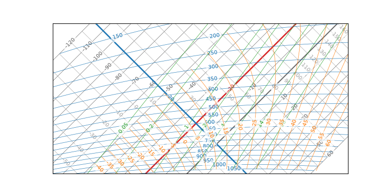
One isotherm and one dry adiabat, picked out of the grid: they cross at a right angle, and every other pair in those two families does the same. The rest of this page is why.
Temperature Against Entropy#
The two coordinates are temperature and entropy. That pairing is the whole design, and it is chosen for a property nothing else has: on a temperature–entropy diagram, the area enclosed by a cyclic process is the energy that process exchanges. A meteorologist reading energy off a chart by eye is reading an area, and it is an area because of this choice.
Entropy is not plotted directly. For dry air the specific entropy is
\(c_p \ln \theta\) plus a constant, where \(\theta\) is
potential temperature — so \(\ln \theta\) is entropy, up to a
scale and an offset that no reader ever needs. The diagram plots
\(\ln \theta\), which is where the name T–ln θ comes from, and why
tephpy’s transforms take pressure and temperature in and give
\(\theta\) back.
Why the Grid Is Square#
On those coordinates two of the five isopleth families are trivially straight, and exactly perpendicular to each other.
An isotherm is a line of constant temperature, so on a T–ln θ plane it is a line of constant T: straight, and parallel to the entropy axis. A dry adiabat is a line of constant potential temperature — a parcel moved without exchanging heat conserves \(\theta\) — so it is a line of constant \(\ln \theta\): straight, and parallel to the temperature axis.
Two families of straight lines, at right angles, covering the plane. That squareness is the property the coordinates were chosen to produce, and it is what makes a tephigram readable: any two of temperature, potential temperature and their difference can be stepped off along a straight edge.
Why It Is Turned#
The rotation is cosmetic in origin and structural in effect. tephpy performs
it in xy_from_temperature_theta:
with \(M_A = 300\) a scale that puts the two coordinates on comparable ranges, and \(\theta_K\) the potential temperature in kelvin. Adding and subtracting the same pair is a forty-five degree rotation, and it has three consequences worth naming.
Isotherms run from bottom left to top right. Along an isotherm \(T\) is fixed, so \(x - y = 2T\) is fixed too: the line has slope one. The Met Office’s printed chart describes them exactly that way — “straight and parallel, running at 45° across the diagram from bottom left to top right” [MetOffice23].
Dry adiabats run perpendicular to them. Along a dry adiabat \(\ln \theta\) is fixed, so \(x + y\) is fixed: slope minus one. The right angle survives the rotation, because rotations preserve angles. That is the entire reason it is safe to turn the diagram at all.
Pressure increases downward. This is what the rotation buys. Cooling and descending both move a parcel down and left, so the ground is at the bottom of the page and the tropopause at the top, which is how anyone thinks about a vertical profile. Unrotated, the same information reads sideways.
Where the Pressure Axis Went#
There is not one. Pressure is derived, not plotted: given a temperature and a potential temperature, Poisson’s relation fixes the pressure, so every point of the diagram’s physical domain already has one without an axis to carry it. Outside that domain there is no pressure to have — which is why a wide view has corners the grid does not reach.
That is why an isobar is a gently curved line rather than a horizontal
rule. tephpy computes each one rather than ruling a grid: it sweeps
temperature along the member’s pressure and takes the potential temperature at
each step, through theta_from_pressure_temperature, and the curve is where those
points land.
The inverse direction is the clearest demonstration that pressure is really
derived. Hover anywhere on the diagram and the cursor readout names a pressure,
because format_coord
converts the position back through pressure_from_temperature_theta. There is a pressure at every
point of the domain, and no axis anywhere carrying it.
It is also why a tephigram cannot be read like a graph with two rulers. The
diagram’s own extent is stated in pressure and temperature, because those are what
a user thinks in, and ax.set_extent(...) converts.
Where the Scales Live#
A fresh tephigram has no scales around its edges. Every family labels its own lines, inline, where there is room for a number — so the values are on the diagram rather than around it, and nothing has claimed an edge. Naming an edge moves a family’s labels there, which is what turns that edge into a scale.
Four edges, five families, so they cannot all have one. But the binding constraint is not that arithmetic. A family can only label an edge its members actually reach, and how many reach is a property of the geometry this page has been describing. Measured at the default view:
Family |
Members in view |
Reaching an edge |
|---|---|---|
isotherms |
19 |
all 19 |
isobars |
19 |
all 19 |
dry adiabats |
35 |
22 |
moist adiabats |
21 |
10, and never more than 4 on any one edge |
humidity mixing-ratio lines |
8 |
all 8 |
Three things follow, and each explains something that would otherwise look arbitrary.
Some families make a complete scale and others cannot. All eight humidity mixing-ratio lines cross the top edge, so that one edge carries the whole family — a scale with nothing missing. Moist adiabats are the opposite case: they are truncated curves that mostly begin and end inside the view, so no edge sees more than a handful, and no edge can be made to carry them. That is not a policy about moist adiabats. It is what a curve that stops in mid-air does to an axis.
A family usually needs two edges rather than one. The isotherms reach an edge 19 times out of 19, but not the same edge: the warm ones leave through the bottom and the cold ones through the left. A placement is therefore a pair of edges more often than a single one, and members that reach neither keep their inline label rather than being dropped. A scale that silently omitted its outliers would be worse than no scale.
The counts belong to the view, not to the family. Zoom in and a curve that crossed an edge no longer reaches it; pan, and one that did not now does. Every number in the table above changes with the extent, which is why the crossings are worked out afresh as you move around the diagram rather than fixed once when it is drawn. The counts and the pairings they recommend are recorded in spec §3.2.7.
Label and Compose the Diagram is the page that claims an edge and retitles it.
What the Printed Chart Adds#
Two conventions on the diagram are not consequences of the mathematics but
decisions somebody made and everybody kept. The isotherms are drawn every 10 °C,
and the 0 °C isotherm is distinguished from its neighbours — on the Met Office’s
printed chart by colouring it red [MetOffice23]. tephpy
follows both: 10 °C at the default view width, on a ladder that selects finer
intervals as you zoom in, and that one member drawn heavier rather than red,
because red is already the temperature profile’s colour. Emphasise a Reference Isopleth
shows how to
change or extend it.
Where to Go Next#
Parcel Ascent and Normand’s Point picks up the other half of the construction — what happens when a parcel is lifted through the grid this page describes.