

Your First Tephigram#
Estimated reading time: 6 minutes
By the end of this page you will have drawn a real radiosonde ascent on a
tephigram and be able to say what every line on it is. No meteorology is assumed.
The only thing you need is tephpy
installed.
A tephigram is a chart for reading the vertical structure of the atmosphere — what the temperature and humidity are doing as you go up. It looks unusual because its axes were chosen for a physical reason rather than a visual one, and Why the Axes Are Rotated is there when you want that reason. For now, take the shape as given and draw one.
An Empty Diagram#
tephpy registers a Matplotlib projection called "tephigram".
Asking for it is the whole setup:
import matplotlib.pyplot as plt

import tephpy  # registers the "tephigram" projection

fig, ax = plt.subplots(subplot_kw={"projection": "tephigram"})
Importing tephpy looks unused, and is not: importing it is what makes the
string "tephigram" mean anything to Matplotlib.
What You Are Looking At#
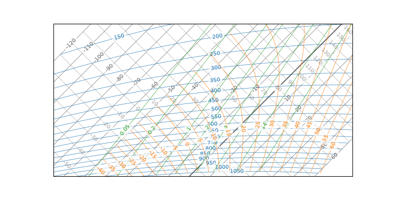
Five families of lines, drawn for you. Each is a set of isopleths — lines joining points where one quantity is equal:
Isotherms, in dim grey, run bottom left to top right. Equal temperature, every 10 °C at this zoom.
Dry adiabats, in light grey, run at right angles to them. Equal potential temperature — the path a dry parcel of air follows as it rises.
Isobars, in blue, curve gently across the diagram. Equal pressure, labelled in hPa, and the closest thing here to a height scale.
Moist adiabats, in orange. The path a saturated parcel follows, which differs because condensing water releases heat.
Humidity mixing-ratio lines, in green. Each marks where air of one moisture content — grams of water vapour per kilogram of dry air — would saturate, so they are lines of constant saturation mixing ratio rather than a reading of what is there.
You do not need to memorise those. Draw a sounding on top and they become scenery — the grid you read a profile against.
A Real Ascent#
tephpy ships two radiosonde ascents so you have something to draw before you
have data of your own. Both are from Norman, Oklahoma on 2013-05-20:
from tephpy import samples

snd = samples.sounding("norman-12z")

fig, ax = plt.subplots(subplot_kw={"projection": "tephigram"})
ax.plot_sounding(snd)
ax.legend()
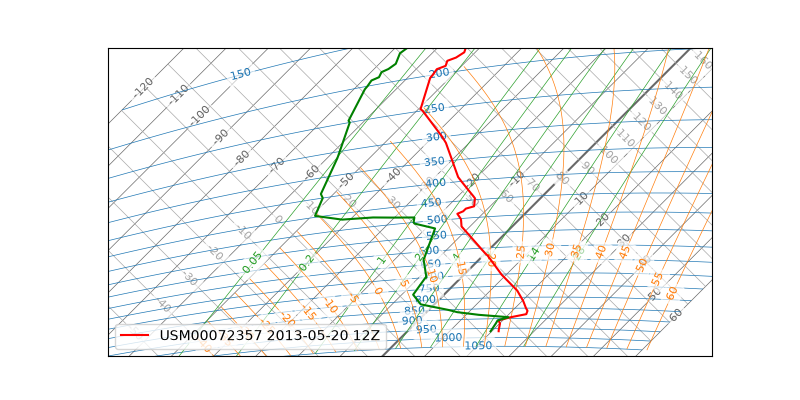
That is a real balloon flight. Its nominal time is 12Z — soundings are filed against a standard hour — and the balloon itself went up at 11:08 UTC. The legend names the station and that nominal hour.
Reading the Two Traces#
ax.plot_sounding(...)
draws two lines, and the difference between them is most of what a tephigram is
for.
The red line is temperature: how warm the air is at each level, from the surface at the bottom to the top of the flight. The green line is the dewpoint: the temperature that air would have to reach to become saturated. It can never be above the red line, because air at its dewpoint is already saturated.
So the gap between them is dryness. Where the two lines are far apart the air is dry; where they close up it is nearly saturated, and where they touch there is probably cloud. Trace the pair upward and you are reading the moisture structure of the atmosphere directly off the chart.
The grid has green lines on it too — the mixing-ratio family from the list above — and they are not the dewpoint. A profile is drawn at three times the width of a grid line, so the two traces are the heavy pair; everything thin is scenery.
The Line That Was Already There#
Look at the isotherms again and one of them is drawn heavier than its neighbours. That is 0 °C, and where the red temperature line crosses it is a freezing level. On this ascent there is one crossing, a little above 600 hPa, and the air stays below freezing all the way to the top of the flight. That is the common case rather than the rule: a warm layer aloft makes the temperature line cross 0 °C again, and a sounding can have several freezing levels — which is exactly what a forecaster is looking for when they expect freezing rain.
It needed no code. tephpy emphasises that one member by default, because the
printed charts this diagram descends from distinguish it too. If you would rather
it did not, ax.isotherms(emphasis={}) turns it off, and
Emphasise a Reference Isopleth shows how to mark other reference lines the same way.
Where to Go Next#
Analyse a Sounding takes this same ascent and does something with it — lifting a parcel through it to find out whether that morning’s atmosphere was capable of a storm. Why the Axes Are Rotated explains why the grid looks the way it does: why those two families are perpendicular, and where the pressure axis went.